Insight · 9 October 2026
The meaning of the Orbitcore ID logo
Three forward slashes, a 13° slant, and different bar widths express the foundations of Orbitcore ID: fiber infrastructure, digital engineering, and room to grow.
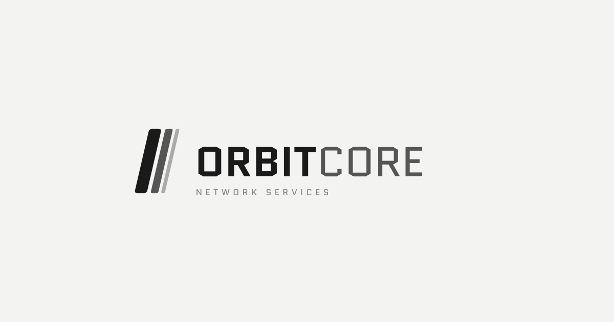
The Orbitcore ID logo starts with a shape familiar to technology teams: the forward slash. Three slanted bars of different widths bring together our work in network infrastructure and digital engineering.
The compact mark is designed to remain recognisable on screens, project documents, and field equipment. Each bar carries a meaning defined in the company’s visual identity guidelines.
Three bars that describe the foundation
The first and widest bar represents fiber optic infrastructure, the physical foundation connecting homes, buildings, and network sites. FTTH, FTTB, and backbone networks are the reference points named in this philosophy.
The second bar represents digital engineering. Websites, applications, and SaaS products work on that infrastructure to help people access information and carry out their work.
The third and narrowest bar represents scalability. A system needs room to grow. In network design, that can mean planning additional capacity. In software, it means a structure that can accommodate changing requirements.
The progression from thick to thin describes layers: strong infrastructure supports the digital solutions above it. The three bars focus on foundations, engineering, and growth.
A 13° slant and a measured sense of progress
The brand guidelines specify an icon slant of 13°. The angle gives the mark a forward direction while keeping its form stable.
We connect that choice to a working principle in the guidelines: precision comes before speed. A fiber route needs checking before it becomes a construction drawing. An application flow needs understanding before it becomes an interface.
The logo repeats one basic shape in a deliberate arrangement. It reflects an intention to work with a clear direction and decisions that can be explained.
Blue for the identity, monochrome for different settings
The primary palette combines Navy Primary #0C447C, Blue Secondary #185FA5, and Light Blue #378ADD. These colours distinguish the icon bars and parts of the wordmark. Pale Blue #85B7EB and Blue Tint #B5D4F4 support dark backgrounds and lighter accents.
The logo system includes four variants: primary, reversed, mono black, and mono white. The primary version is used on light backgrounds, while the reversed version keeps the mark readable against navy.
Monochrome variants suit single-colour printing, stamps, embossing, and field equipment. On a website with a neutral interface palette, black and white variants keep the identity visible without adding colour to every element.
Quantico and the wordmark
Quantico is the brand typeface specified in the guidelines. The wordmark pairs ORBIT in Bold 700 with CORE in Regular 400. The difference in weight creates a clear emphasis within one name.
The guidelines pair Quantico with Inter for body text in brand applications. Website interface typography also follows the page design system so that paragraphs, navigation, and long articles remain comfortable to read. The wordmark retains its own identity reference.
Clear space helps the logo stay readable
The guidelines set a minimum clear space on every side equal to the icon’s height. This space helps the mark remain readable alongside headlines, photographs, and other elements.
The stated minimum sizes are 180 px for the horizontal logo, 24 px for a digital icon, and 10 mm for a printed icon. Choose the variant that fits the background and medium.
Keep the proportions, icon direction, and colours of the official variants consistent. Avoid stretching, rotating, adding shadows, or using low-contrast backgrounds. These rules help the same form remain recognisable at different sizes.
One identity across four services
The three-bar philosophy informs how Orbitcore ID works. Our four service categories apply it to different needs:
- CONNECT covers internet and connectivity.
- CREATE develops websites, web applications, and SaaS solutions.
- LINK plans fiber networks and engineering documentation.
- GEO works with geospatial data and mapping through PetaNusa.
We want the identity to remind the team of the work ahead: build the foundation carefully, explain decisions honestly, and leave room for growth.
Read the story of Orbitcore ID, or explore our services to see the scope of each discipline.
Source: PT Orbitcore Network Services visual identity guidelines, Brand Guidelines 2025.